asp-plot: Automated Diagnostic Reports for Satellite Stereo DEMs
If you’ve ever processed satellite stereo imagery to generate a Digital Elevation Model (DEM), you know the drill: you wait for the processing to finish, then you open up the results in QGIS or some other GIS tool, squint at the hillshade, flip between a dozen intermediate files, and try to figure out if your DEM is any good. It’s tedious, it’s manual, and it’s easy to miss problems.
I got tired of this workflow, so I built asp-plot — a Python package that automatically generates diagnostic visualizations and comprehensive PDF reports from NASA Ames Stereo Pipeline (ASP) output. One command, and you get a full quality assessment of your stereo DEM processing results.
The problem
ASP is an incredible open-source tool for generating DEMs from satellite stereo imagery. It supports everything from WorldView and ASTER on Earth to HiRISE on Mars and LROC NAC on the Moon. But ASP’s output is a collection of rasters and log files — it doesn’t give you a nice visual summary of what happened during processing.
When you’re running dozens or hundreds of stereo pairs (as we often do in our UW cryosphere group), you need a fast way to triage results. Which pairs had good bundle adjustment? Where did the stereo correlation struggle? How does the DEM compare to independent elevation data? Answering these questions manually for each pair doesn’t scale.
What asp-plot does
The package reads ASP processing directories and generates a multi-page PDF report covering every step of the pipeline:
- Input scenes — the left and right stereo images
- Stereo geometry — skyplot and map view of satellite acquisition angles, convergence angle, and other quality metrics
- Match points — interest points identified between images during correlation
- Bundle adjustment residuals — before and after maps showing how well the camera models were refined
- Detailed hillshade — the DEM rendered as a hillshade with zoomed insets at low, medium, and high uncertainty areas, plus corresponding ortho imagery
- DEM results — the stereo DEM, triangulation intersection error, and difference relative to a reference DEM
- Disparity maps — pixel offsets with quiver overlays
- ICESat-2 validation — comparison against NASA’s ICESat-2 laser altimetry data, with per-landcover statistics and along-track elevation profiles
- Processing parameters — a record of the exact commands used, for reproducibility
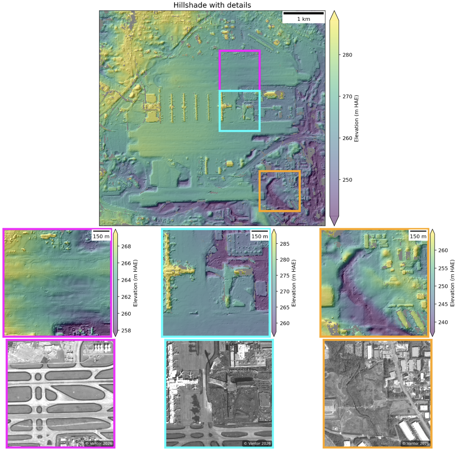
Example detailed hillshade page from an asp-plot report, showing elevation-colored hillshade with zoomed insets at varying uncertainty levels.
That hillshade page is one of my favorites. It automatically picks three subsets from areas of low, medium, and high intersection error, so you can immediately see where the stereo correlation worked well and where it struggled. The corresponding ortho image subsets below let you understand why — maybe there’s a water body, or dense vegetation, or some other surface that’s tough to correlate.
The ICESat-2 comparison
The package queries NASA’s SlideRule service for ICESat-2 ATL06-SR data overlapping the DEM footprint, computes elevation differences, and breaks down the statistics by land cover type.
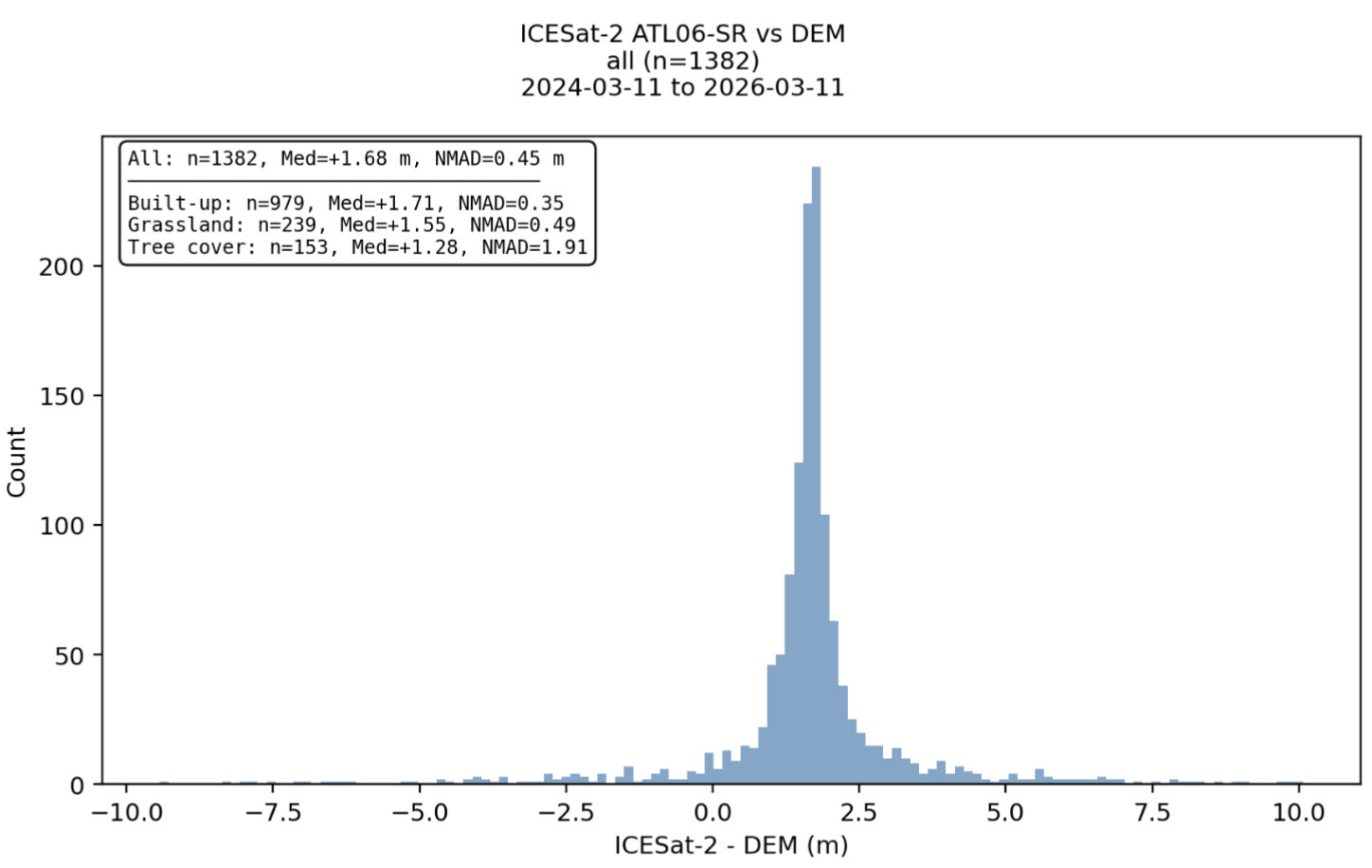
ICESat-2 ATL06-SR elevation compared against the stereo DEM.
This is useful for understanding DEM accuracy without needing ground control points. You can see right away if there’s a systematic vertical bias, and whether accuracy varies across different land cover types (spoiler: tree cover is often the worst).
Example report
Here’s a full example report generated from a WorldView stereo pair over Hartsfield-Jackson Atlanta International Airport. The airport is a great test case — it has flat runways (easy for stereo), tall buildings (challenging for stereo), and plenty of ICESat-2 overpasses for validation.
Full 13-page asp-plot report for a WorldView stereo pair over Atlanta. Open in new tab.
Usage
Getting started is straightforward. Install from conda-forge or PyPI:
conda install -c conda-forge asp-plot
Then point it at your ASP processing directory:
asp_plot --directory /path/to/stereo_run/ \
         --bundle_adjust_directory ba/ \
         --stereo_directory stereo/ \
         --map_crs EPSG:32616 \
         --report_filename my-report.pdf \
         --report_title "My Stereo Pair"
That’s it. A few minutes later you have a comprehensive PDF report. The package also exposes a Python API if you want to generate individual plots or customize the analysis — check out the notebook tutorials for more details.
Multi-sensor support
One thing that makes asp-plot flexible is its support for different satellite sensors and even planetary data. The same reporting framework works for:
- Earth: WorldView, GeoEye, ASTER
- Moon: Lunar Reconnaissance Orbiter NAC
- Mars: MRO CTX, MRO HiRISE, MGS MOC
The sensor-specific notebooks in the documentation show examples for each. For Moon and Mars, the ICESat-2 altimetry comparisons (Earth only) are replaced by LOLA and MOLA, respectively.
What’s next
I’m continuing to develop asp-plot as part of my work with the UW cryosphere group. So expect frequent updates and potential breaking changes!
If you work with ASP and want to try it out, the package is fully open source: GitHub | Documentation | conda-forge. Issues and PRs are welcome!